In early 2026 Raftelis went through an internal brand refresh with new colors, fonts, and elements. We participate in over 10 conferences a year so our booth set up was the first real application for this new branding. I lead the process starting with research of the best banner systems, coming up with how to arrange the banners in the booth spaces, and then designing for all of these new pieces.
These new banners were a big leap for Raftelis on the exhibit floor showcasing our new brand in a modern and functional way by introducing internally lit banners and a digital screen. I’m very proud of how they turned out and I am able to say I owned 100% of the process.
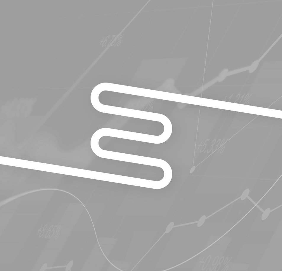
Ellio is a software product created to help clients manage their financial data and track performance goals. The logo for this needed to be modern and fit into the software/technology landscape. I wanted the icon to represent the “E” in Ellio and have the flexibility to be used creatively in other materials, and lettering matches the style of the icon keeping with linear strokes.
Ellio has since been adopted by several organizations and has plans to scale in the future. If you need to manage your financial data and track performance, you can check out Ellio here, let em know Jack sent you.
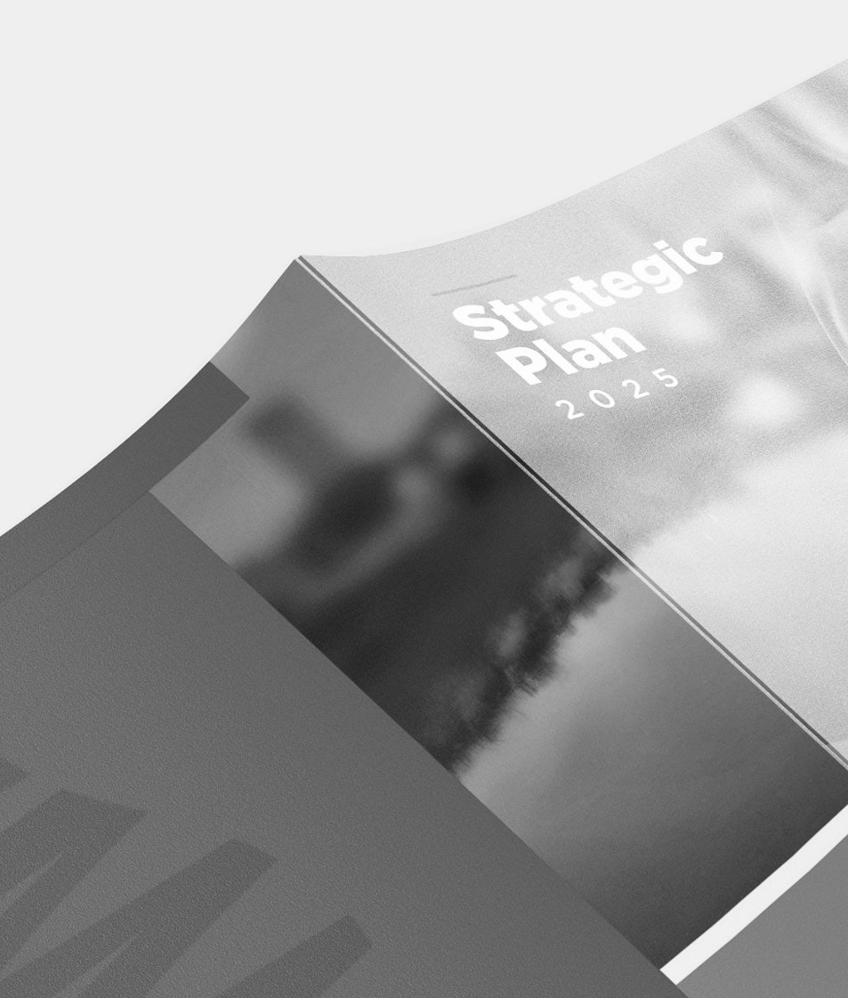
Strategic plans are documents that put the future strategy of an organization into writing for its customers and employees. It was my job communicate that plan in an on brand and visually engaging way.
I always enjoyed working for larger clients such as Columbus Water and Power because they tend to have the photography assets to support my design ideas. You will see spreads with large images and cutouts making these documents feel more like magazines than a brochure handout.
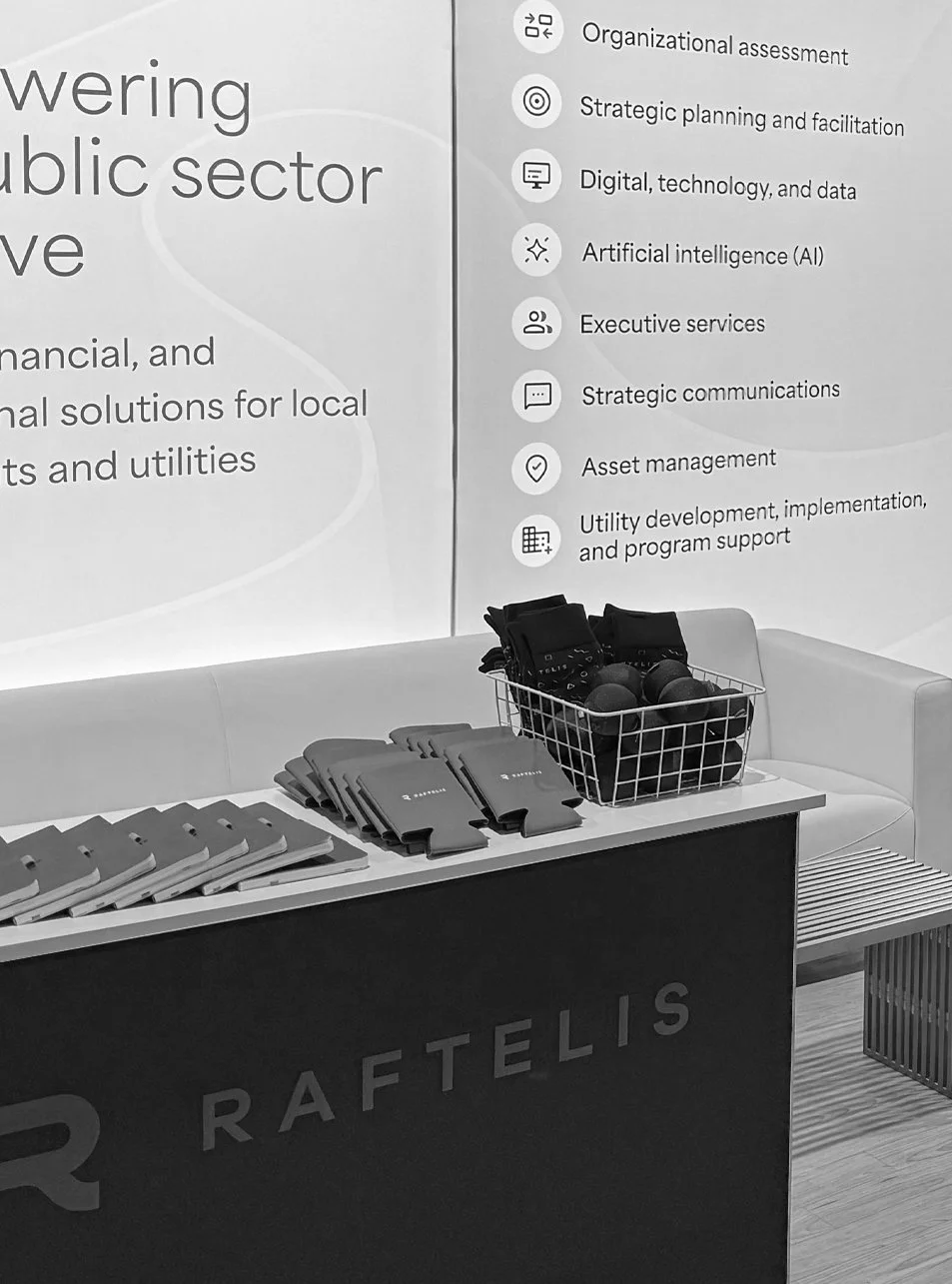
Raftelis attended several national conferences throughout the year ranging from 10×10 ft to 20×20 ft booths. This meant a lot of promo items or “swag”. But where most companies handed out branded chapstick that ends up in the trash we wanted our promo items to actually bring people to the booth, both through design and quality.
The”pop-up” piece is an internal item all of the employees of the company receive. The white circles could be filled with custom designed stickers when the person was given a shout out that aligned with one of the company’s expectations.
You’ll also see an example of our booth setup. I didn’t directly design the banners, but managed the promo items and logistics for the conferences throughout the year, sometimes going to the conferences myself to make sure the booth ran smoothly. (I wore a lot of hats)
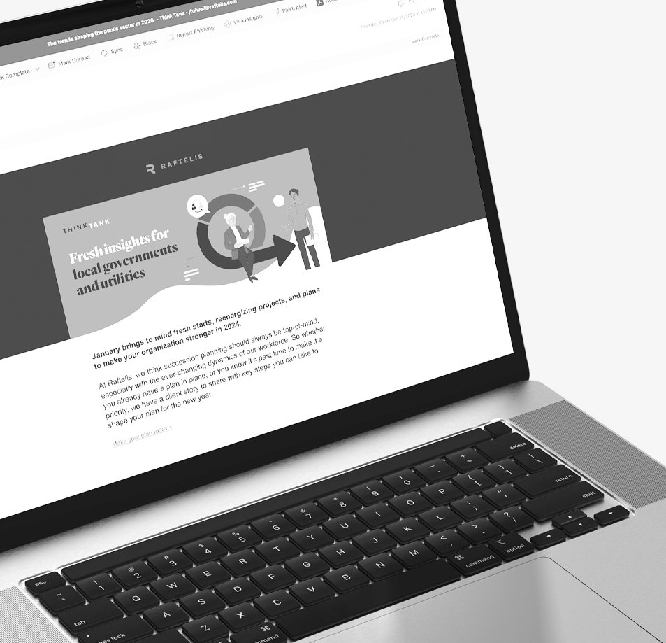
At Raftelis we wrote and designed newsletter style emails once a week. We used HubSpot for the build and designed custom elements such as the header as needed.
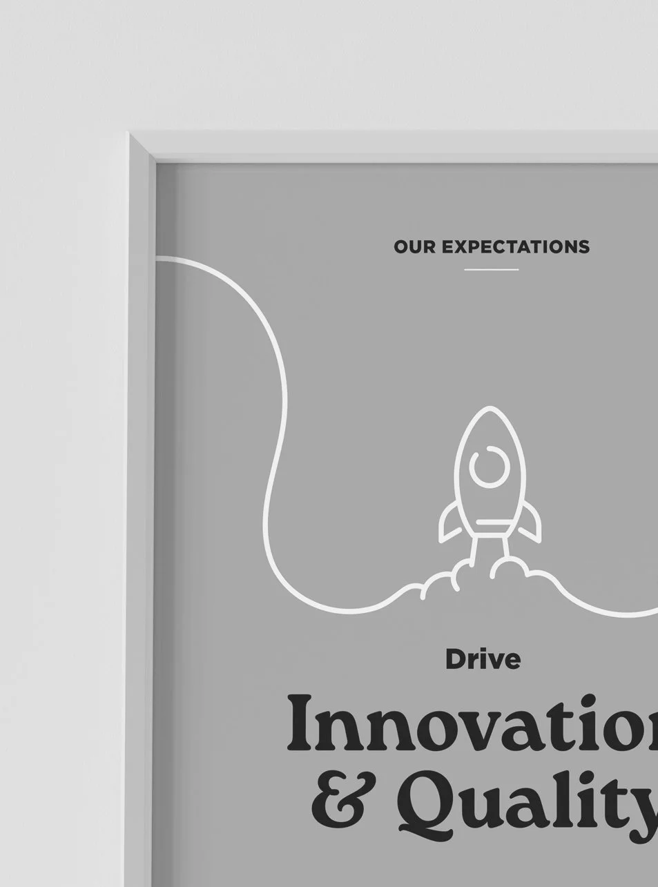
These posters were an opportunity to add some color to the otherwise neutral and fluorescently lit office. Bold brand colors and a connected design make these posters worthy of the wall space.
Work is simply work most of the time, but sometimes a project lands on your plate that makes you inspired for its cause. That was the case with the Cleveland Tree Coalition. A group who’s goal is to replant trees throughout the city of Cleveland bringing nature back to its urban areas. I designed a number of deliverables for their marketing campaign, from physical handouts to social posts.
This project was a reminder that design can do more than just make things look nice, it can make a real difference.
Strategic Plans are documents that put the future strategy of an organization into writing for its customers and employees. It was my job communicate that plan in an on brand and visually engaging way.
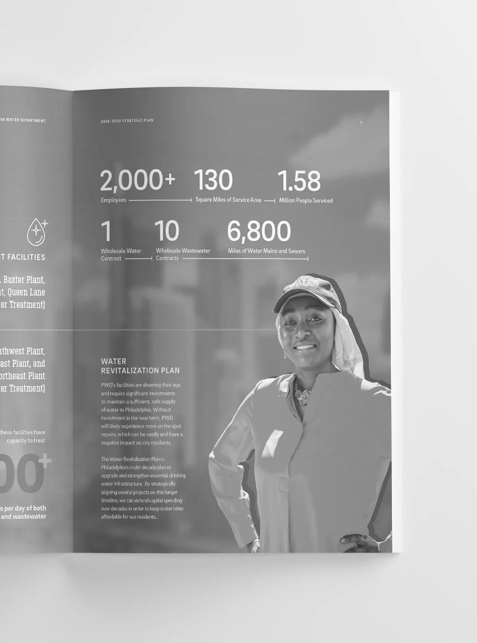
The Philadelphia Water Department plan taught me how to adapt in the middle of a design. Many times clients are ironing out the content as it is being designed or key department heads change resulting in layouts shifting. This is never ideal, but when the core design elements are solid you can flex the layouts to new content quickly and keep it visually consistent with the rest of the pages.
Strategic Plans are documents that put the future strategy of an organization into writing for its customers and employees. It was my job communicate that plan in an on brand and visually engaging way.
Baltimore Department of Public Works had just undergone a brand refresh. This plan and social posts would be the first time the branding would be put to use. It was exciting to show the Baltimore team the possibilities for how their new brand could be used across different media. This plan was unique in that I worked with an illustrator who created illustrations and outlines of photography elements that I mixed with the text and images.
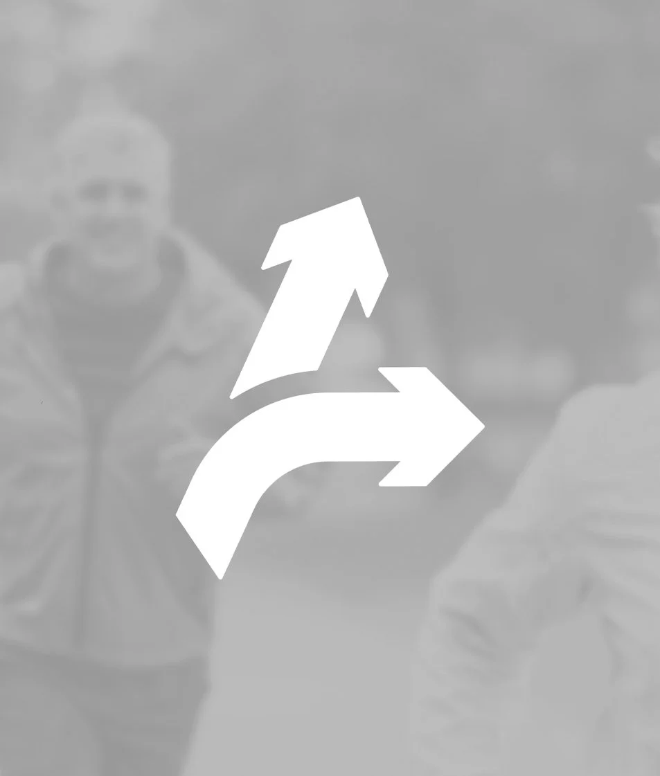
Get Up, Get Out or GUGO (a strange acronym but one you won’t soon forget) is a program designed to encourage employees to well, Get Up and Get Out instead of sitting at their desk for an unhealthy amount of time.
The logo had to be energetic, dynamic, and have a sense of movement. The use of arrows literally reinforced the key message of “Get up, Get Out” and created a strong icon that can be used on its own when the lengthy full name and acronym can’t be used.
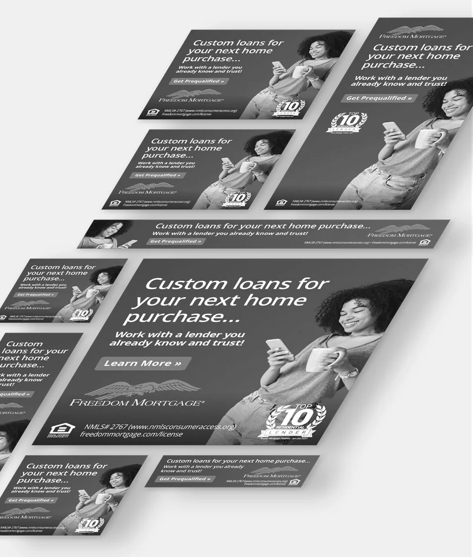
Digital banner ads. The truest test of a designer’s mental fortitude. About once a month we would create several versions of these with different copy/images for testing. Each round ending with about 60-70 ads on average after doing the animated versions. While a lot of work, they were great practice for creating a design flexible enough to be used across all of the required sizes. Picking which elements to keep and which to remove all while keeping the ads part of the same visual family.
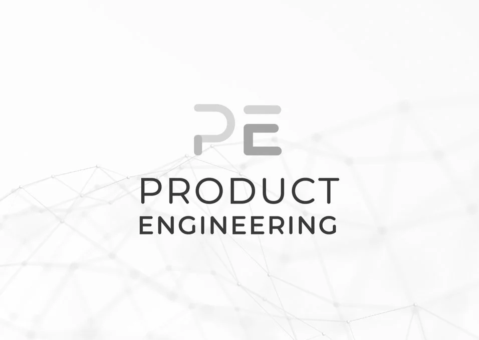
Product Engineering is a branch of Freedom Mortgage’s IT department that wanted to become a more established “branded” team. Product Engineering’s mission is to build technology products to support the larger mortgage company, both for customers and internal employees alike. They wanted to communicate this through a simple and clean look.
I was interested in using the P and E as the primary mark, deconstructing them to be more interesting than just letters but still recognizable as the initials of the department. Clean strong angles with the stacked lockup created a logo that feels confident and intelligent. The colors helped to bring it down from feeling too luxury and keep it feeling approachable.
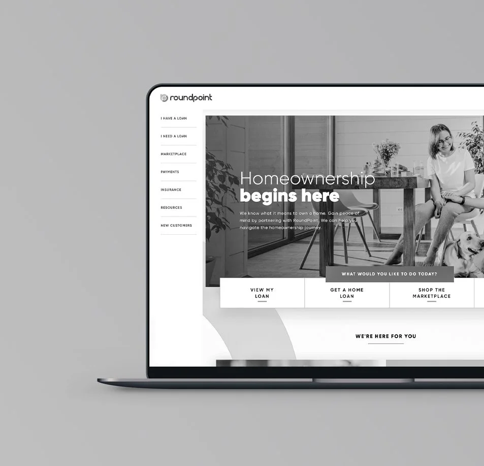
When I started at RoundPoint Mortgage Servicing Corporation they had a website experience that was as dull as the company’s name. Luckily, within the first year of my employment the website transformation project fell to me.
Throughout the life of the project I performed as an Art Director, Project Manager, Web Designer, and Content Coordinator. I also helped develop the website through our content management system. In the end, the team pulled off a website that is easy for people to use and communicates the modern RoundPoint brand.
Unfortunately, when RoundPoint was acquired by Freedom Mortgage the business strategy of the website shifted and has sense undergone a full rebrand. The images you see here are from the website prior to the Freedom Mortgage acquisition.
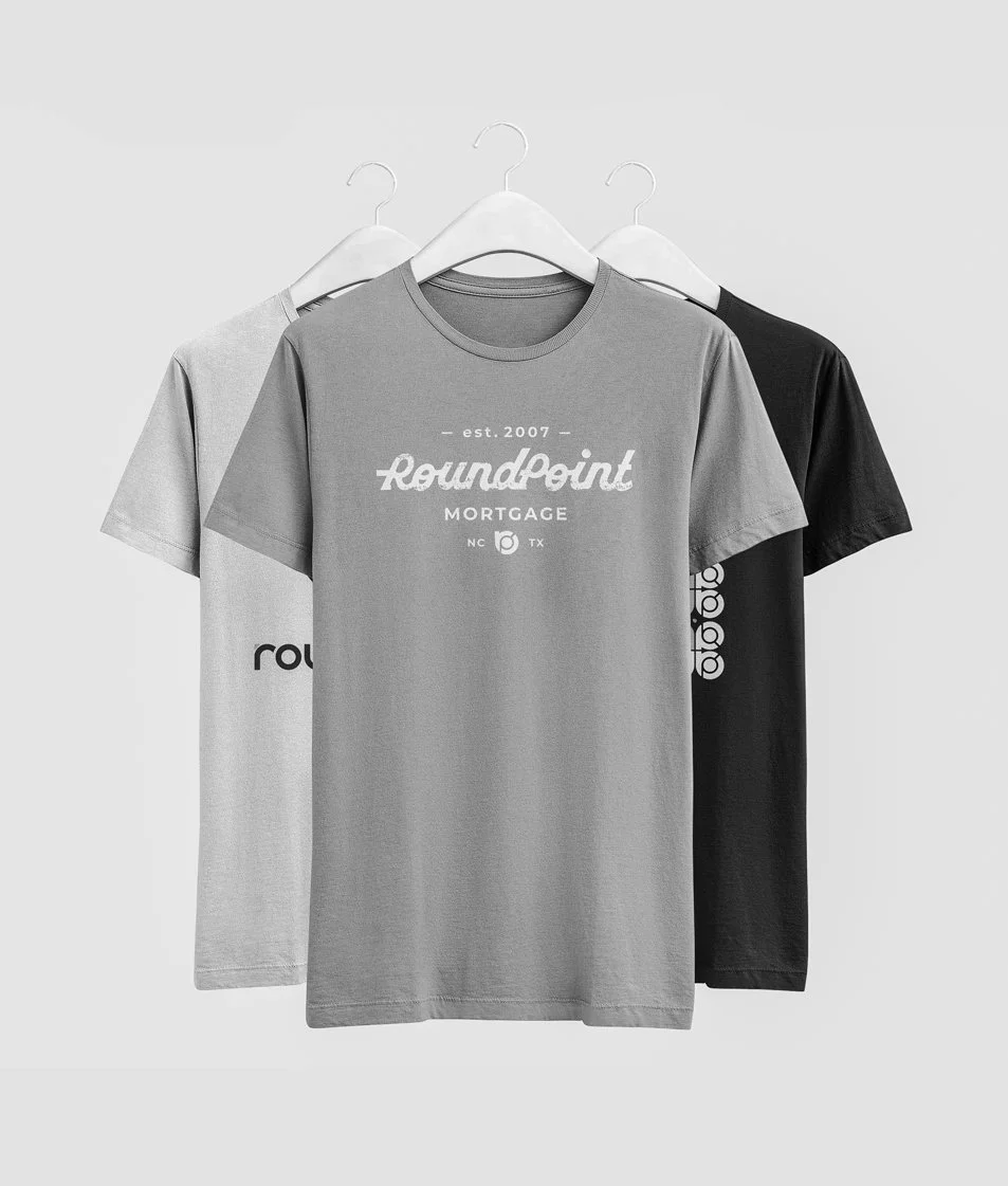
Clothing design projects are typical on corporate marketing teams. Pieces that will be handed out to entire companies during a retreat or given to clients at conferences. They are a fun change of pace and a challenge to make something a large audience would want to actually wear.
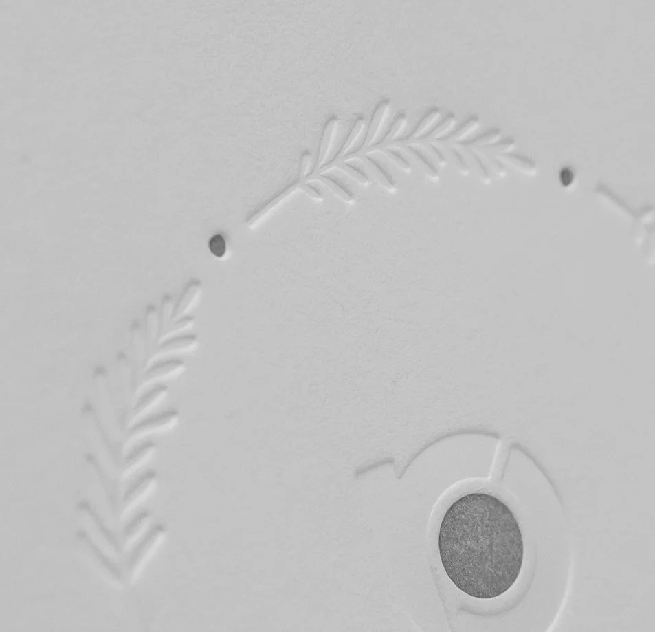
This holiday card has a simple design on the front, but is taken to the next level with an embossed treatment and ink applied to specific areas. It’s a premium design that will not be joining the other boring cards in the waste basket this holiday season.
If you were a designer at any point during the COVID-19 pandemic, you were inevitably asked to create some branded virtual backgrounds to help hide the messy homes of employees during their online meetings.
These backgrounds were a way for employees to use the brand in a more personal way somewhat like wearing a company T-shirt. They were also another tool to help us all feel just a little bit more connected when remote work was becoming the new normal for us.
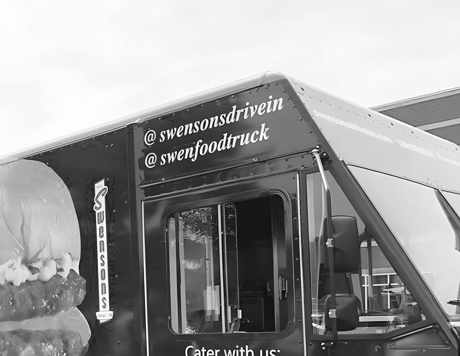
Swensons is a drive-in style restaurant that wanted to bring their famous burgers straight to the customer with a fleet of food trucks. I had the opportunity to design a full wrap for the latest truck. The challenge was combining the Swensons’ campy design style with a new level of professional design.
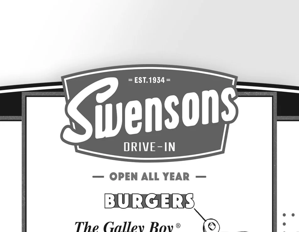
Swensons provides a drive in style dining experience for their guests and the menu is a crucial part of that. I designed a large menu board that mounts to the sides of the restaurants and handout menus given to guests by the “runners” who take their order.
We used creative solutions such as hand drawing key menu items when proper photography wasn’t available and using the shape of the logo as a backer to pull the menu board together.